Category: Article
-
trippler multi-destination
It’s time for my EV trip planning app trippler to cater to multiple destinations, beyond the beaten track of simple A-to-B trips. This is another feature I decided I needed when planning and driving The Cross to The Cape. Multiple changes I’ve wanted multiple destinations for some time, but recent refactoring of the UI and…
-
trippler contingencies
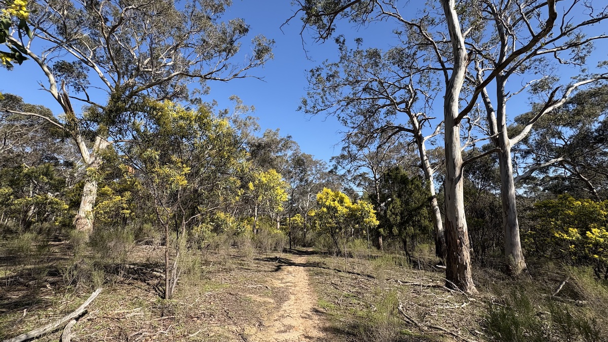
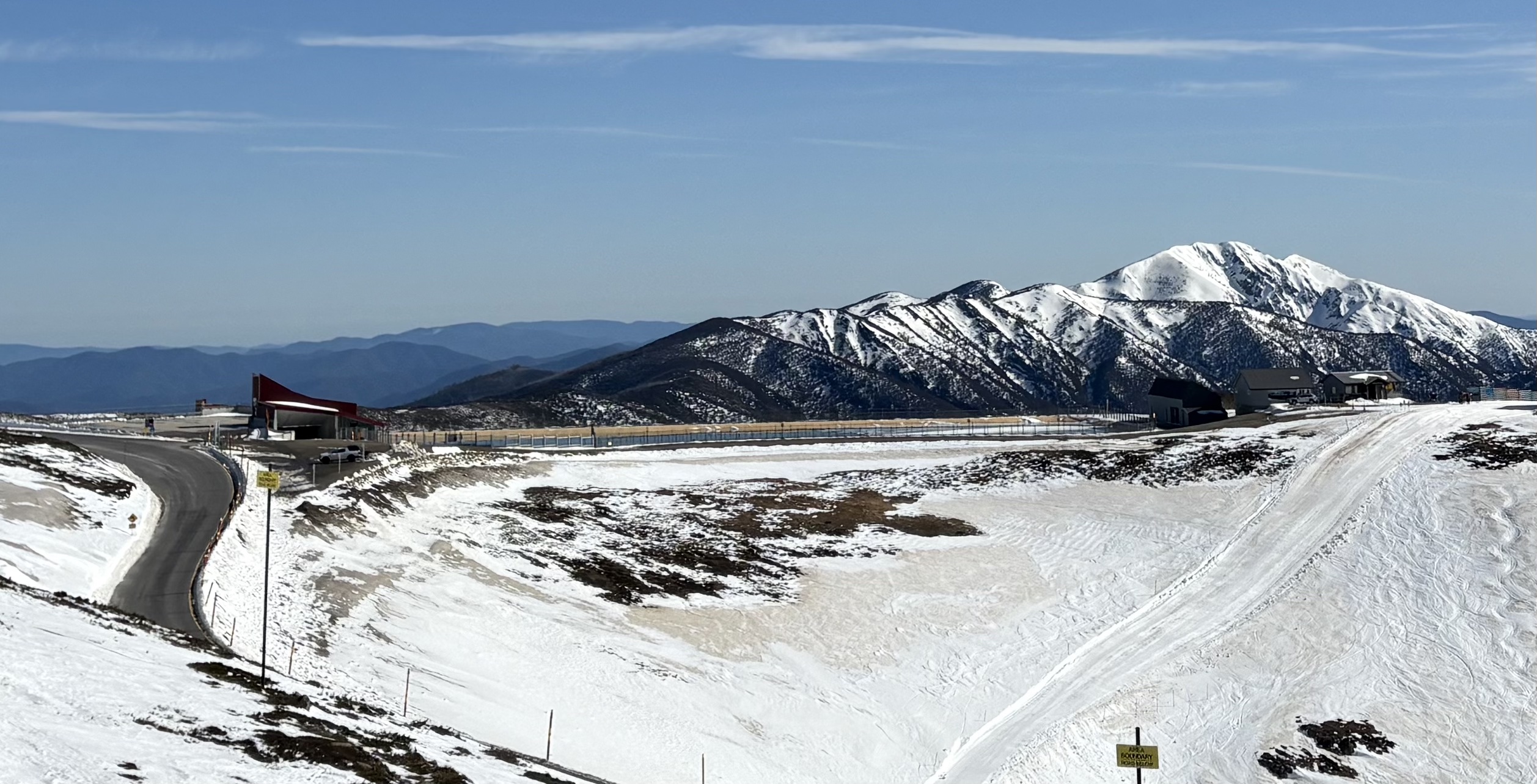
Planning a dawn-to-dusk adventure from snow to surf in an electric vehicle meant not just planning for resilience, to allow for changes to the plan, but also planning for contingencies, to know in advance exactly how to respond to changes. Carnival of carving We lay our scene on the descent from Mount Hotham to Cape…
-
Orienteering map training turns 20
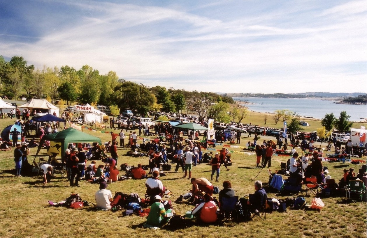
A little over 20 years ago, I was introducing my wife and some friends to orienteering in Jindabyne. With my family involved in the Scottish 6 Days since its 1977 inception, I had been orienteering since before I could walk, and reading orienteering maps was second nature to me. Not second nature to the rest…
-

Basketball shot clock human state machine
I’ve only come to basketball as a parent, and in that capacity I often find myself on shot clock duties, as one of the few people who seems to enjoy – or at least tolerate – the shot clock. Perhaps I tolerate – or even enjoy – the shot clock because I imagine myself a…
-

trippler for Aotearoa New Zealand
Planning to present my PyCon AU talk to an internal audience at MYOB, I realised the title An EV trip planner for Australia, while entirely appropriate for an Australian conference on Python, wasn’t as inclusive as it could be for the members of a technology organisation encompassing Australia and Aotearoa New Zealand. So trippler now…
-

Reflecting on UI polish
I’ve been meaning to give the trippler UI a glow up for MY2025 and my PyCon AU selection finally provided the impetus. In previously envisioning migrating to a Javascript front-end (vibe coded?), I was possibly making the next step bigger than it needed to be, as I’ve managed to squeeze a bit more out of…
-

Effective ML Teams in Korean
We received our copies of the Korean translation of Effective Machine Learning Teams this week!
-

22 rules of generative AI, 2 years on, Ghibli intermission
This update comes at the peak of the Ghiblification fad. There’s nothing new here and yet I found the release of and response to GPT 4o image generation, including mechanistically crushed and artificially reconstituted Ghibli, particularly shocking. So here’s a retrospective case study for the recent review of rule #10 (labelling ingredients) and a longer…
-
22 rules of generative AI, 2 years on, part 1
How has my original post on 22 rules of generative AI aged in a period of rapid change? Are these solution considerations as enduring as I thought? Let’s reflect on the original advice and developments in the meantime. Apologies again for minimal references as I timeboxed the writing. In general, evidence should be discoverable/verifiable with…
-

Charger hopping
While it’s nice to make good time, when in remote areas, sometimes any route will do. For EV road trip planning in trippler, I first found the direct route, then chose chargers along the route. This approach can fail when there aren’t enough chargers close to the route, as in remote areas. Charger hopping is…