Category: Data
-

Leading data and AI teams
I gave my 2026 YOW! Tech Leaders Summit talk the alternative title lossy compression, as it squeezes 28 years in tech into 25 minutes. Many individual slides are are pointers to multiple blog posts or book chapters in their own right! This post includes references, by section from the source slides. Applications over three decades…
-

Hard problems in highly agentic coding
Highly agentic coding with LLMs has great promise: automatically generating software to solve a wide range of problems. But it comes with its own hard problems to solve. With my experience in product design search and optimisation, software development, robotics and manufacturing, it’s an area I’m very interested in understanding better. What I share here…
-

Why are teams twelve times faster?
In my writing about team effectiveness something like the following quote might appear: How bad is backlog coupling? At an Australian telecommunications company, my colleagues did a study of hundreds of pieces of work or tasks passing through a delivery centre. Some tasks could be completed by a single team without dependency, specifically without scheduling…
-

The life-changing magic of tidying your data
After tackling data waste for some years now, I thought it would be fun to revisit the Marie Kondo approach to tidying up work in large organisations (from 10 years ago), and apply it to data too… Surprise! Managing work data in a large organisation is a lot like keeping your belongings in check at…
-

Antifragile AI Architectures
AI is full of contradictions: capable but unreliable, local improvements create externalities, generalist models are evaluated against specific criteria, and so on. Antifragility is a framework that deals in contradictions too, and seems an appropriate lens through which to explore AI systems architecture, as I had used it in an earlier era to explore hand-crafted…
-

Data and AI mini blogs
A brief reflection on Thoughtworks Australia Data & AI mini-blogs. From May 2021, we set ourselves a target to publish a short blog on a different AI, ML or data topic every week. Here’s the pitch from the landing page: Bite-sized content delivering valuable insights from Thoughtworkers who wrestle varied client problems week in and…
-

LLMs are lineage black holes
Data lineage is important to most organisations, even if they don’t make use of it. Systematically capturing the upstream provenance and downstream consumers of any piece of data is critical to trusting the utility of that data and understanding its impacts, at any scale beyond a handful of excel spreadsheets. The nature of lineage When…
-

trippler multi-destination
It’s time for my EV trip planning app trippler to cater to multiple destinations, beyond the beaten track of simple A-to-B trips. This is another feature I decided I needed when planning and driving The Cross to The Cape. Multiple changes I’ve wanted multiple destinations for some time, but recent refactoring of the UI and…
-

trippler contingencies
Planning a dawn-to-dusk adventure from snow to surf in an electric vehicle meant not just planning for resilience, to allow for changes to the plan, but also planning for contingencies, to know in advance exactly how to respond to changes. Carnival of carving We lay our scene on the descent from Mount Hotham to Cape…
-
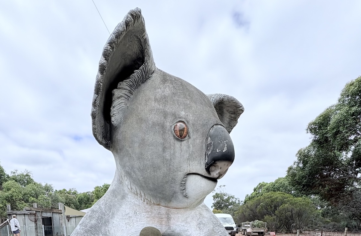
trippler at PyConAU
I was thrilled to be back for my second PyCon AU – with a wonderfully diverse and inclusive group of technologists – presenting on trippler in a talk titled An EV Trip Planner for Australia. I got a great feedback, including a suggestion to incorporate the many very Australian BIG things we might encounter on…