Category: Maths
-

Conceptual inertia
Here I revisit how interaction cost explains technical debt as the difference between understanding and implementation. (…inspired by hallway conversations at YOW! Tech Leaders Summit about Ward Cunningham’s original definition of technical debt…) Interaction cost is my term for second-order (n2) costs that arise in activities with interacting elements. In this category, I would put…
-

Leading data and AI teams
I gave my 2026 YOW! Tech Leaders Summit talk the alternative title lossy compression, as it squeezes 28 years in tech into 25 minutes. Many individual slides are are pointers to multiple blog posts or book chapters in their own right! This post includes references, by section from the source slides. Applications over three decades…
-

Hard problems in highly agentic coding
Highly agentic coding with LLMs has great promise: automatically generating software to solve a wide range of problems. But it comes with its own hard problems to solve. With my experience in product design search and optimisation, software development, robotics and manufacturing, it’s an area I’m very interested in understanding better. What I share here…
-

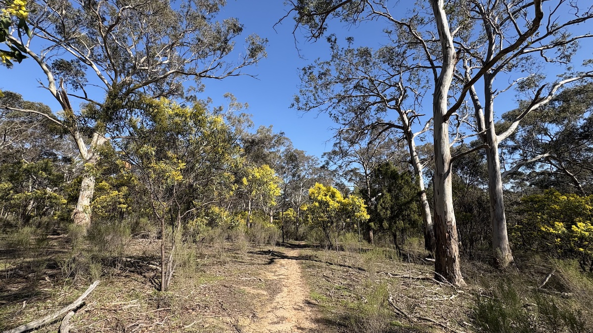
trippler – and resilience for all
After driving an EV at possibly the busiest Australian road-tripping time of the year (Easter), in the middle of a global fossil fuel crisis and concomitant surge in local EV sales, I decided it was time to make good on my claim that resilient planning by individuals could benefit all drivers. In practice, this means…
-

Antifragile AI Architectures
AI is full of contradictions: capable but unreliable, local improvements create externalities, generalist models are evaluated against specific criteria, and so on. Antifragility is a framework that deals in contradictions too, and seems an appropriate lens through which to explore AI systems architecture, as I had used it in an earlier era to explore hand-crafted…
-
trippler multi-destination
It’s time for my EV trip planning app trippler to cater to multiple destinations, beyond the beaten track of simple A-to-B trips. This is another feature I decided I needed when planning and driving The Cross to The Cape. Multiple changes I’ve wanted multiple destinations for some time, but recent refactoring of the UI and…
-

trippler contingencies
Planning a dawn-to-dusk adventure from snow to surf in an electric vehicle meant not just planning for resilience, to allow for changes to the plan, but also planning for contingencies, to know in advance exactly how to respond to changes. Carnival of carving We lay our scene on the descent from Mount Hotham to Cape…
-
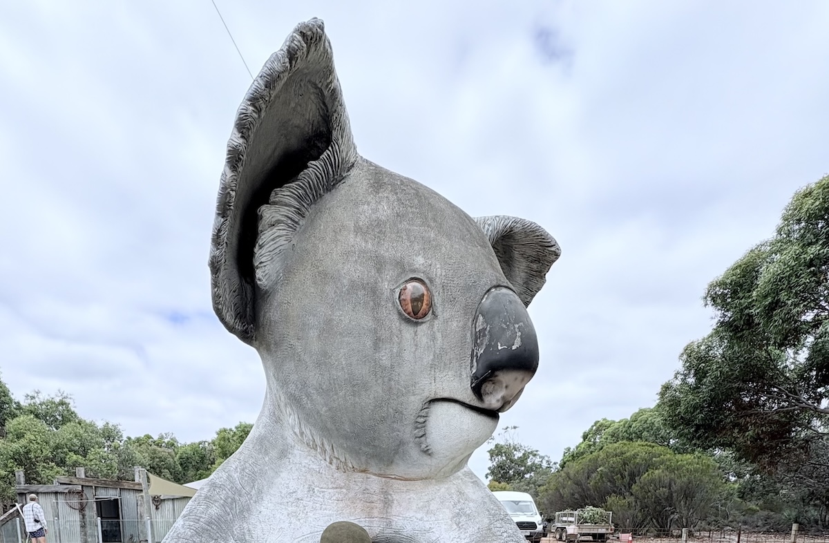
trippler at PyConAU
I was thrilled to be back for my second PyCon AU – with a wonderfully diverse and inclusive group of technologists – presenting on trippler in a talk titled An EV Trip Planner for Australia. I got a great feedback, including a suggestion to incorporate the many very Australian BIG things we might encounter on…
-

An evergreen question: what is an MVP?
I was asked this the other day. My answer was: it depends on the context; it helps to have an example. And the contextual element is probably why this remains an evergreen question. While I have a fresh example in mind I thought I’d quickly plant a stake in the ground for reference. First, it…
-

trippler development notes
This is the behind-the-scenes companion post to a resilient charging planner, sharing more on the development process and how the app works, with links back to earlier work. Design philosophy I wanted to focus on the core problem of interactively exploring charging options under varying trip requirements. I wanted a tool that I would use…