Category: Maths
-

A resilient charging planner
Check out the prototype of trippler, an interactive charging planner for resilient EV road trips. Based on my own EV road trip experience, trippler is as much about easily understanding charging options and contingencies, to reduce charger anxiety, as it is about coming up with a single best plan. If you’re looking for the latest…
-

Data complications
Solving EV charger anxiety used maths for better road trips, but skipped over using real data. Let’s fix that, or at least try to… The easy bits To get from A to B in an EV, I used Open Route Service to find a base route to a destination and and Open Charge Map to…
-

Solving EV charger anxiety
Many EV adventures are accessible using the charging network in Victoria, but faulty chargers still have the potential to induce charger anxiety on road trips. Planning apps–EV drivers’ constant companions–may not fully solve this when the reported status of chargers is unreliable and faults are prevalent. As a driver, I want resilient plans that already…
-

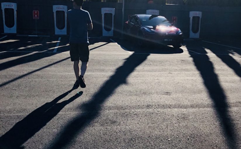
EV snow’d tripping
Adventures with EVs often involve big mountain climbs, which consume additional energy, impacting range. I recently had the opportunity to drive climbs from Bright to Omeo and back via Mt Hotham, in Gunaikurnai and Taungurung country, and get a sense for how EVs handle hills. I collected efficiency data for each leg of a road…
-

EV adventuring with resilience
Road trips are the most demanding EV scenario currently in Australia, especially to remote destinations. However, a little planning shows that they are still quite doable. Did the plans survive contact with reality? Mostly. In short, it was a pleasure to drive an EV long distances and the only inconvenience was faulty public charging infrastructure.…
-

EV adventuring
Electric Vehicles (EVs) are great for weekend adventures and more. In Australia in 2024, it still requires a little extra planning, but many adventures are achievable with that little extra, and as infrastructure continues to improve, there will be ever less transport planning for ever more adventuring! For the time being, I’ll run you through…
-

Privacy puzzles
I contributed a database reconstruction attack demonstration to the book Practical Data Privacy by my colleague Katharine Jarmul. While we might think anonymous summary data is safe to share, this attack demonstrates it’s possible to dramatically reduce the search space for re-identification, in this case from half a trillion quadrillion possibilities to just one! My…
-

Maths Whimsy with Python
At PyCon AU 2023 in Adelaide I delivered a talk titled Maths Whimsy with Python. It was a great chance to review a range of projects small and large I’ve already shared here. Check out the slides and video. In three years of the maths whimsy repo, I’ve covered a lot of ground, and got…
-
On stage with Adam Spencer
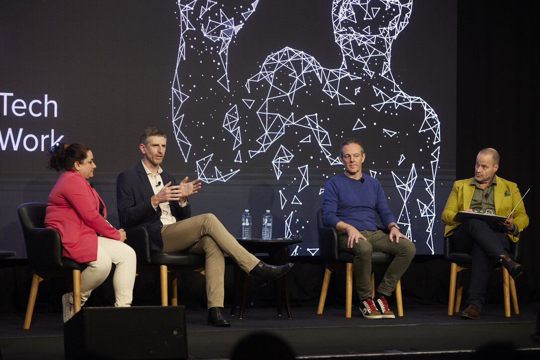
That’s the post. I was on stage with Adam Spencer. We talked about Generative AI with excellent co-panellists Muneera Bano and John Cox (I hope to the benefit of the AI conference attendees), but growing up a maths nerd and Triple J listener in the 90s, the green room chat with Adam was my highlight!
-
Electrifying the world with AI Augmented decision-making
I wrote an article about optimising the design of EV charging networks. It’s a story of work done by a team at Thoughtworks, demonstrating the potential of AI augmented decision-making (including some cool optimisation techniques), in this rapidly evolving but durably important space. We were able to thread together these many [business problem, AI techniques,…